Typography plays a vital role in visual communication, influencing how messages are perceived and understood. Among the various font styles available, slab serif fonts stand out for their bold, strong, and authoritative presence. Whether used in print, digital design, or branding, these typefaces offer a unique blend of durability and elegance. In this article, we’ll explore the characteristics, history, uses, and best practices for using slab serif fonts effectively.
What Are Slab Serif Fonts?
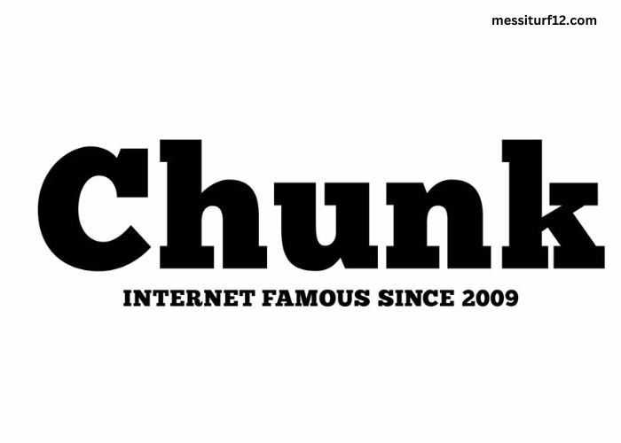
Slab serif fonts are a type of serif font characterized by thick, block-like serifs. Unlike traditional serifs, which have delicate and tapered edges, slab serifs have a more robust and pronounced appearance. This makes them particularly useful in contexts where readability, strength, and impact are essential.
Key Characteristics:
- Thick Serifs: Their defining feature is the heavy, squared-off serifs that give a solid and grounded look.
- Uniform Stroke Width: Unlike modern or transitional serifs, slab serif fonts often have little contrast between thick and thin strokes.
- Versatility: They work well for both digital and print media, making them popular in advertising, editorial, and branding applications.
- Bold Presence: These fonts command attention and convey confidence, making them ideal for headlines and logos.
A Brief History of Slab Serif Fonts
Slab serif fonts emerged in the early 19th century during the Industrial Revolution. As businesses expanded and advertising became more prevalent, the need for bold, eye-catching typography grew. The first slab serif typefaces were introduced in the early 1800s, catering to the increasing demand for attention-grabbing signage and posters.
One of the earliest slab serif typefaces was Clarendon, designed in the mid-19th century. Over time, different variations of slab serif fonts emerged, including geometric, humanist, and typewriter-style versions. These fonts became a staple in publishing, branding, and even digital design as technology advanced.
Popular Uses of Slab Serif Fonts
Slab serif fonts have a wide range of applications due to their bold and adaptable nature. Here are some of the most common areas where they excel:
-
Branding and Logos
Many brands use slab serif fonts in their logos to convey strength, trust, and reliability. Companies that want to project a solid and professional image often opt for slab serifs because of their bold and authoritative look. Notable brands like Volvo and Sony have incorporated these fonts in their identities.
-
Print and Editorial Design
Magazines, newspapers, and books often use slab serif fonts for headlines and subheadings. Their high readability and distinct presence make them suitable for grabbing the reader’s attention in both print and digital formats.
-
Advertising and Marketing
Bold typography is a crucial element in advertisements, and slab serif fonts are a natural fit. Whether on billboards, posters, or online banners, these fonts ensure the message stands out clearly and effectively.
-
Web and UI Design
Although sans-serif fonts dominate web design, slab serif fonts are becoming increasingly popular in modern UI/UX designs. They add personality and character to websites, creating a strong and memorable impression.
-
Sports and Outdoor Branding
Sports brands and athletic-themed designs often use slab serifs to evoke strength and endurance. Their rugged, no-nonsense appearance makes them perfect for fitness-related logos, apparel, and promotional materials.
Best Slab Serif Fonts to Use
With many variations available, choosing the right slab serif fonts depends on the specific project and desired aesthetic. Here are some of the most popular options:
-
Roboto Slab
A modern and versatile slab serif font that works well for both digital and print applications. It maintains readability while still delivering a strong visual impact.
-
Clarendon
One of the original slab serif fonts, Clarendon remains a popular choice for branding, publishing, and signage.
-
Rockwell
A geometric slab serif font with clean lines and balanced proportions, ideal for headlines and logos.
-
Egyptienne
A classic slab serif font with a strong historical influence, frequently used in editorial and book design.
-
Courier
A typewriter-style slab serif font that retains a classic and nostalgic feel, commonly used in coding and scripts.
How to Use Slab Serif Fonts Effectively
While slab serif fonts offer many benefits, they should be used thoughtfully to maintain balance and readability in design. Here are some best practices:
-
Pair with a Contrasting Font
Since slab serifs are bold and dominant, they work well when paired with a softer sans-serif or a light serif font. This creates a balanced and visually appealing contrast.
-
Use for Headlines and Emphasis
These fonts are most effective when used for headlines, logos, and short bursts of text. Avoid using them for long paragraphs, as their heavy serifs can make extended reading challenging.
-
Consider Spacing and Size
Adjusting letter spacing (kerning) and size ensures readability and aesthetic appeal. Slab serif fonts look best when given adequate space to breathe.
-
Stick to a Minimal Color Palette
Because of their bold nature, slab serif fonts often work well in monochrome or simple color schemes. Too many colors can make the design feel overwhelming.
Conclusion
Slab serif fonts are a timeless choice for designers looking to convey strength, reliability, and confidence. Their bold structure and distinctive look make them ideal for a variety of applications, from branding and editorial design to advertising and web interfaces. By understanding their characteristics and best practices, designers can leverage slab serif fonts to create impactful and visually appealing typography. Whether you’re working on a logo, an ad, or a website, incorporating the right slab serif font can elevate your design and make a lasting impression.